 David Chia
- 40rooms
- 2,000residents a year
- 90events a year
My role
Product designer and product builder: from the problem to a working tool.
- Research. Understanding how stays were managed and where each tool failed.
- Validation with the people involved. Every solution was checked with those who manage stays before it was considered done.
- Product decisions. What goes in and what stays out: the single source, the map, the smart list and everything that was ruled out.
- Design. Flows, interface and visual system.
- Build. The MVP in 15 days, with Firebase and AI-assisted development.
Before we start
This document covers the state of K Rooms in 2026: the product and system decisions made from the first commit to the close of the MVP.
It is not a success story. It is an inventory of decisions: what was built, what was ruled out and why.
The starting decision
Konvent is a cultural center in Cal Rosal, run on a volunteer basis by the people who live there. A very wide range of people pass through the house: permanent residents, temporary residents, event participants, visiting artists, and family and friends.
Someone already took care of deciding who slept where. What was missing was a single place to manage all that information, with quick lookups and less room for error.
The founding decision of K Rooms was to abandon the fragmented model (Excel, paper and everyone’s own codes) and build its opposite: a single place where the information lives, updated instantly and accessible to the 3 or 4 people who coordinate the work.
That decision forced four questions that a product team can usually take for granted:
- Who is going to use this? Not a dedicated team, but volunteers in their free time. The tool has to remove work and learning, not add them.
- Are all stays the same? No. There are 3 types of stay, sharing the same root but with different needs.
- What happens when volume grows? A form that works for one person is a burden for thirty. A second path is needed.
- Is a room a fixed piece of data? No. Its status can change from day to day, so managing it is an operational task, not an administrative one.
The rest of the document explains how K Rooms answers each one.
What came before
The operational problem
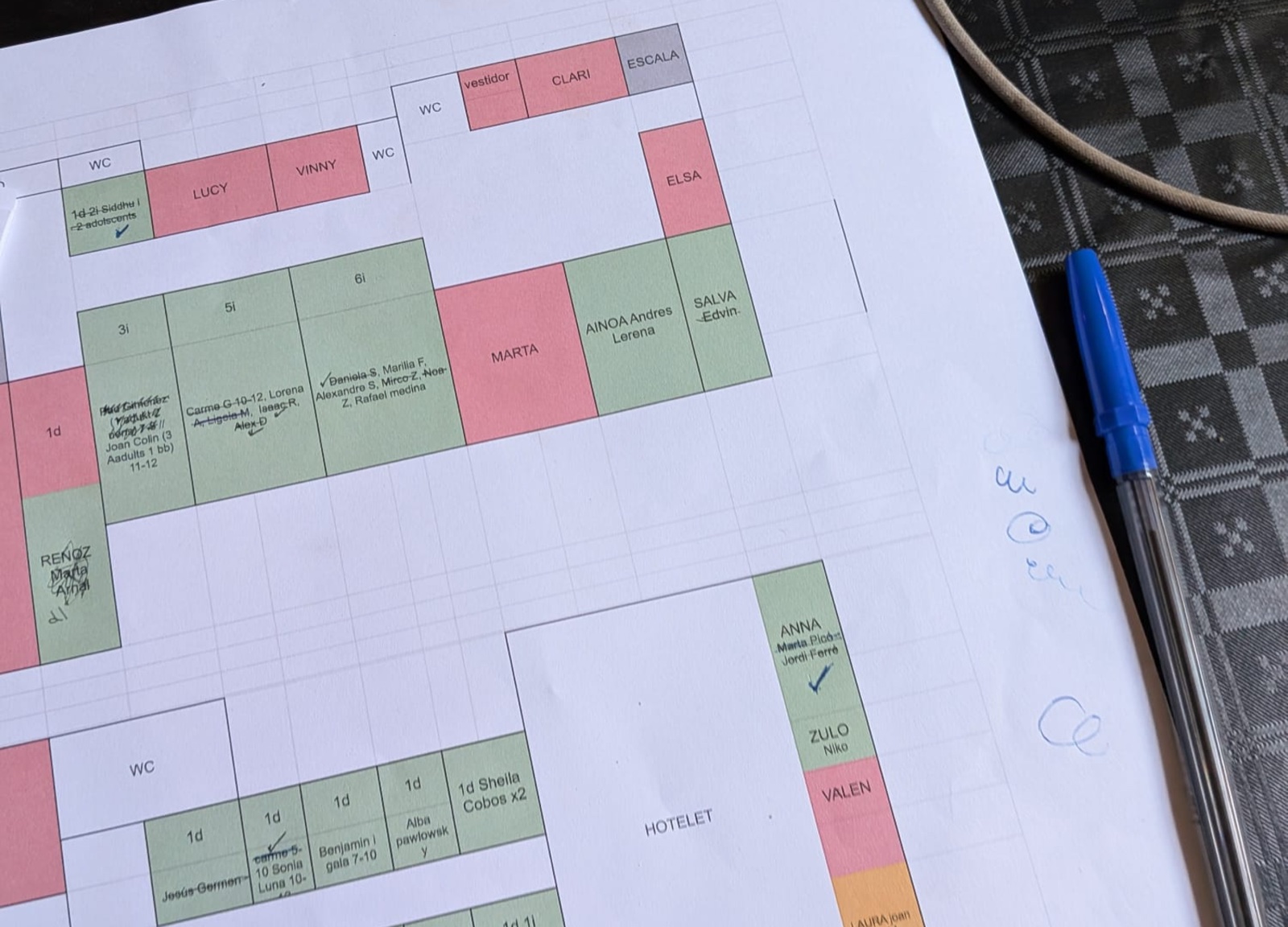
Before K Rooms, stays were managed with a set of analog tools: a spreadsheet, its printed plan and hand-written labels on every door. Each held part of the information, and what was noted in one did not appear in the others.
What was failing
- Several sources instead of one. Every change meant updating several media by hand.
- Constantly changing information. Arrivals, departures, last-minute changes. Reality moved faster than the tools.
- No source was reliable. The Excel fell out of date and the paper did not capture the changes. None was the truth; all were partial versions.
- Everyone used their own codes. Understanding a note depended on who had written it and whether they were available to explain it.
- Keeping it up to date took time. Extra work that disrupts the daily routine of the volunteers.
One room, two people
Two people were organizing two different events. One kept their part on paper; the other, in the Excel. The same room ended up assigned to two guests at once.
It was not an oversight. The system did not guarantee that information arrived in time: each person noted things with their own tool and in their own way, and coordination only worked if someone sat down to cross-check the different sources.
It was not an anecdote. It was the most visible symptom of fragmentation.
For that reason, K Rooms proposes a single circuit: whoever manages enters or edits the information just once, and the data and the rooms update instantly.
From a generic product to a tailored one
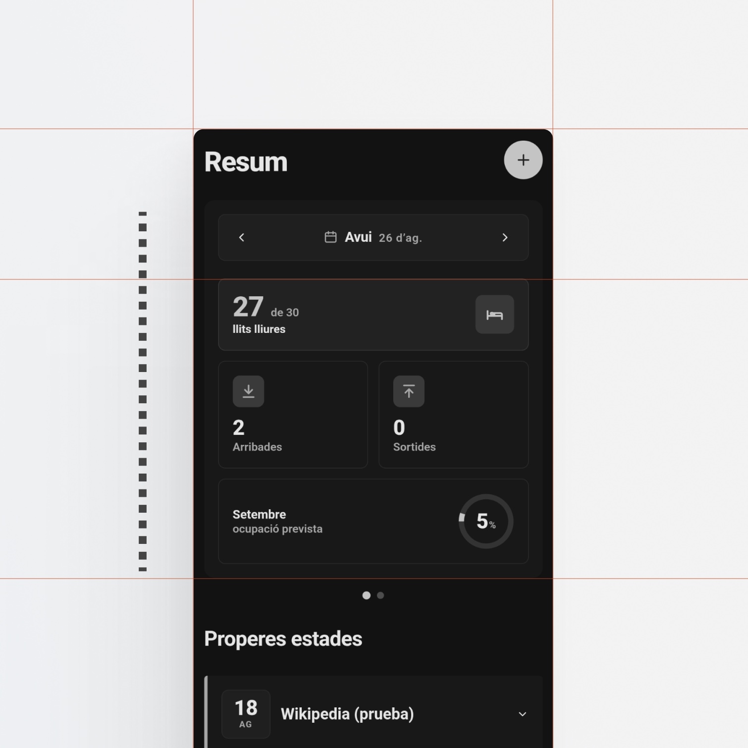
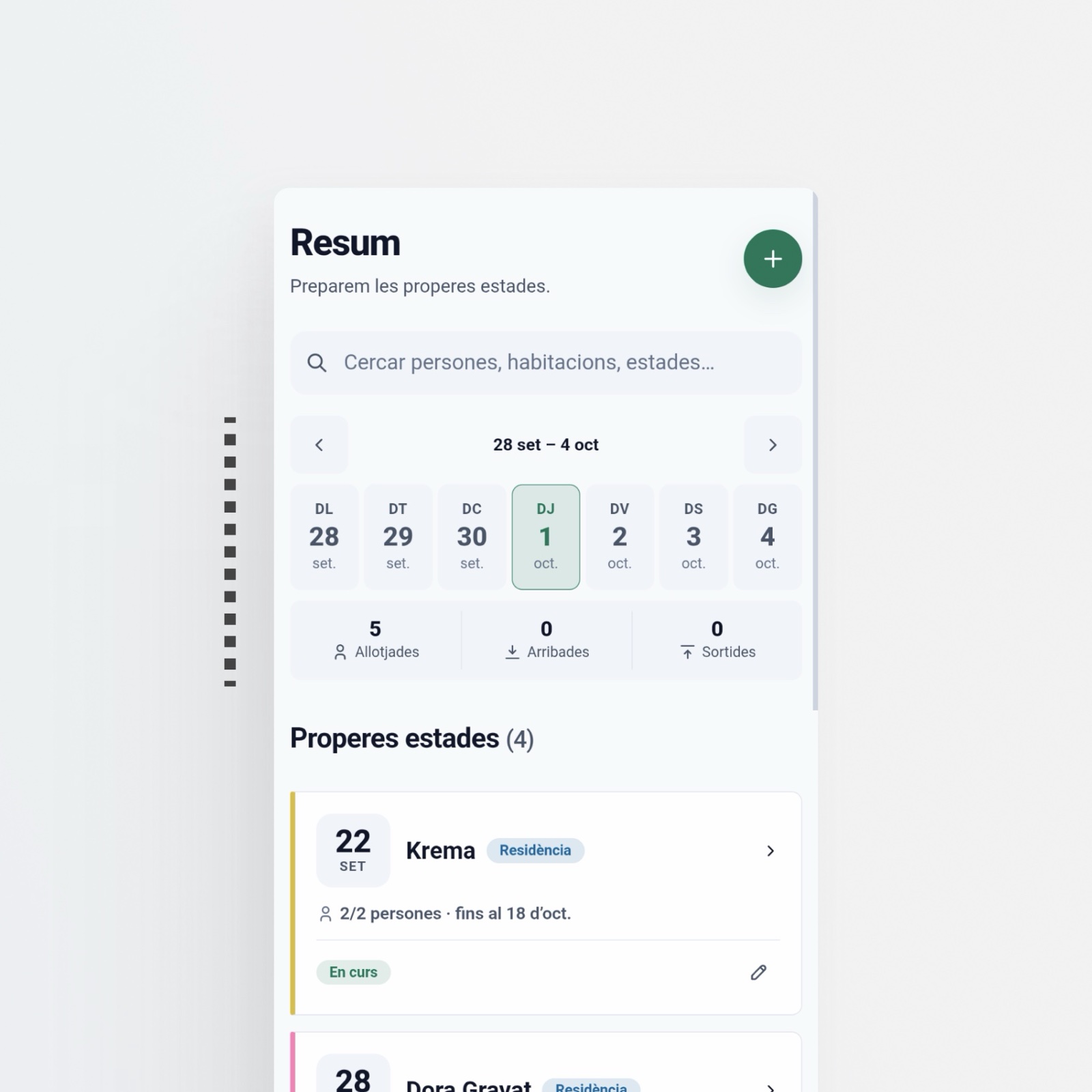
1 · Only the data people actually use
| The initial idea | A card with horizontal scroll: daily occupancy and, on swipe, weekly. The same data at two zoom levels. | |
| The clash | It duplicated the information without adding anything new. More noise, not better decisions. | |
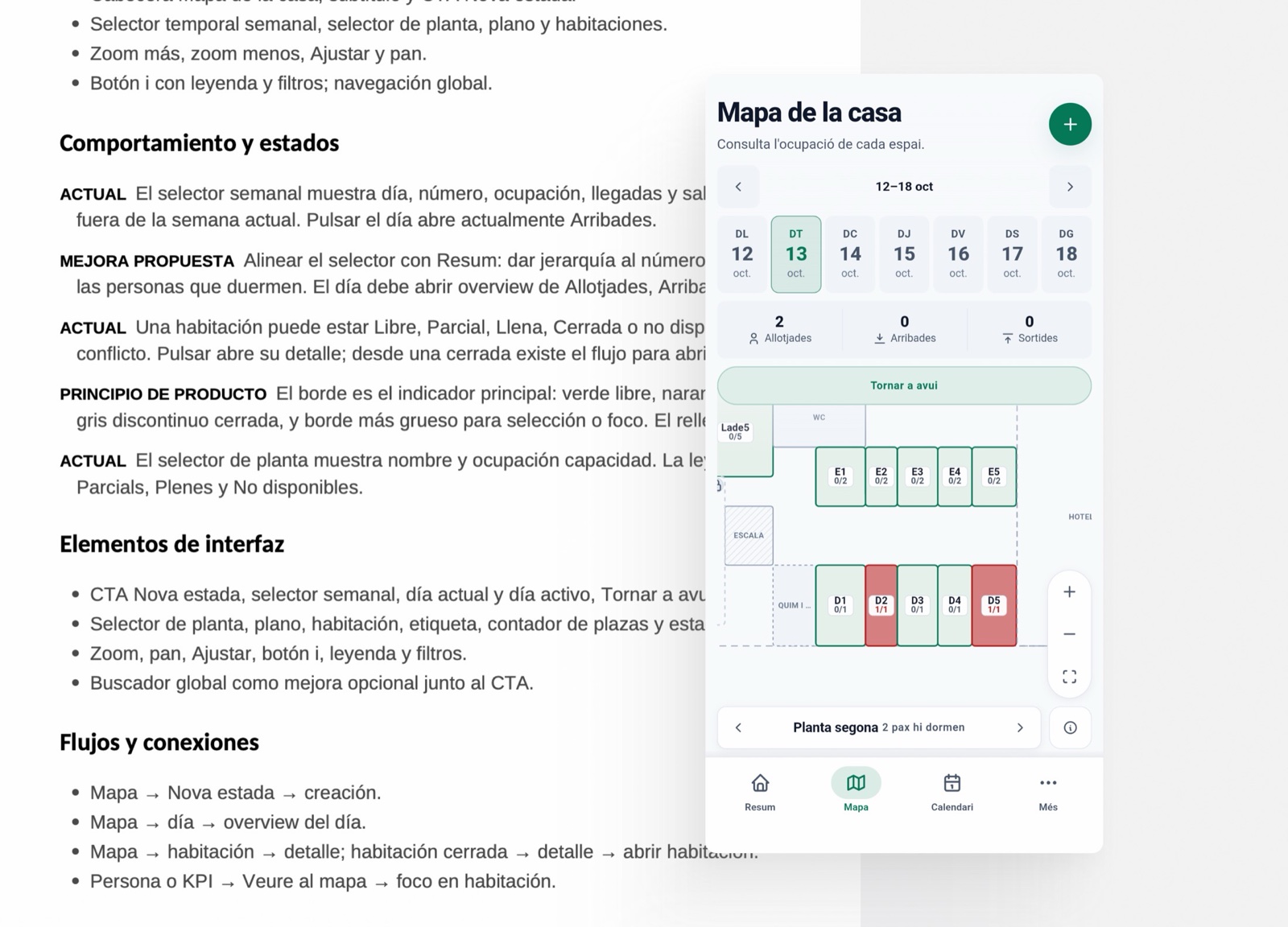
| The redesign | A single level: three indicators for the day (how many people are sleeping, how many arrive, how many leave) and, instead of the scroll, a visual date selector. | |
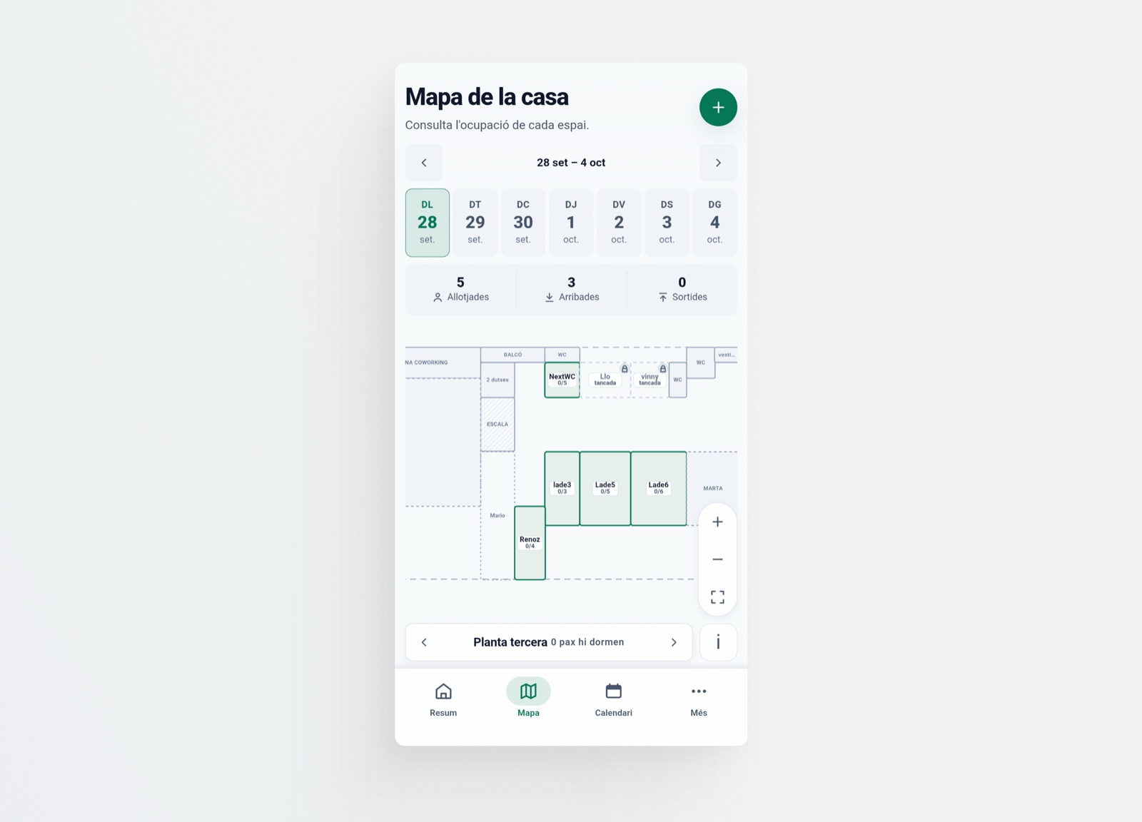
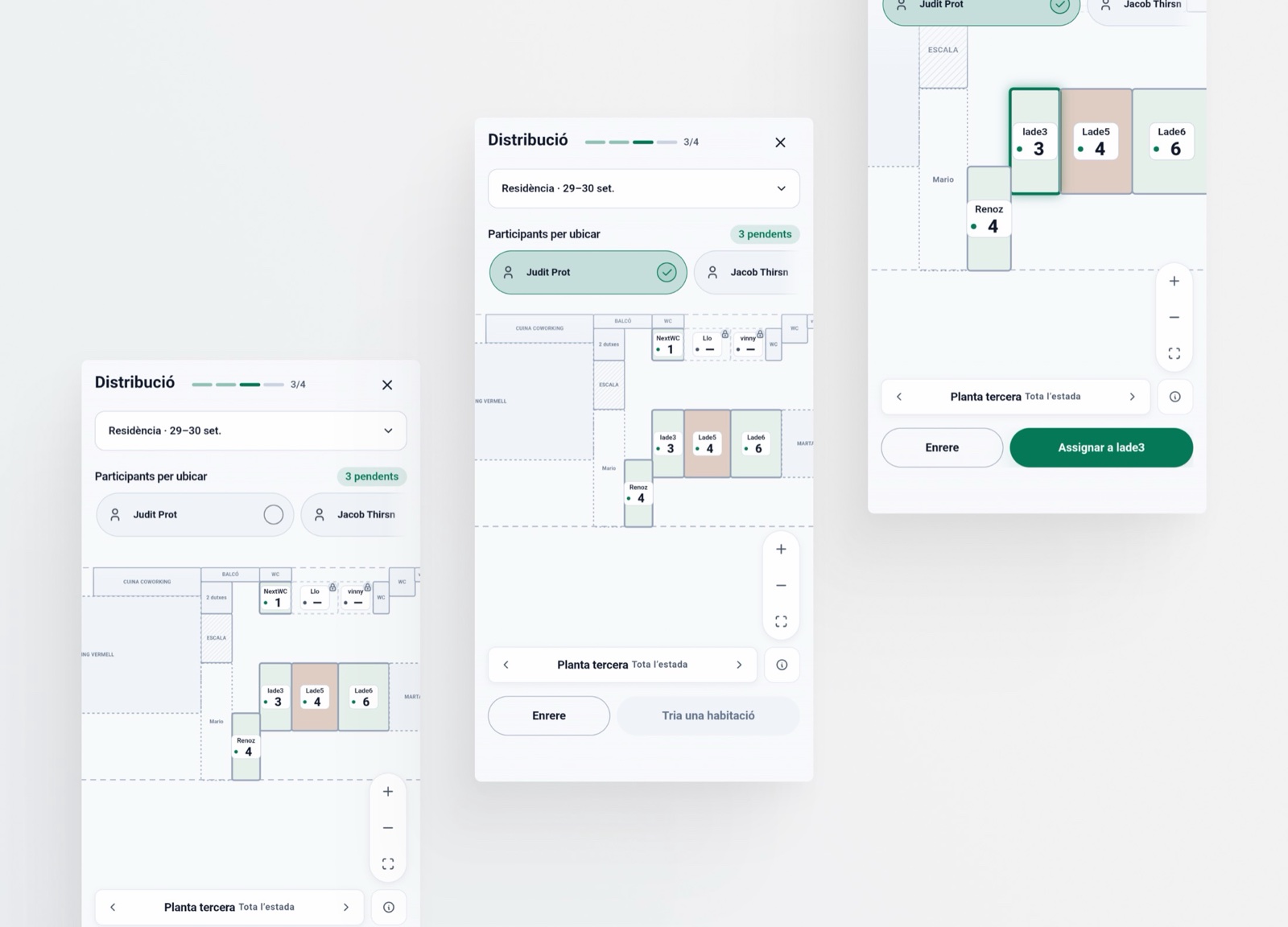
2 · A map, the way people already solved it
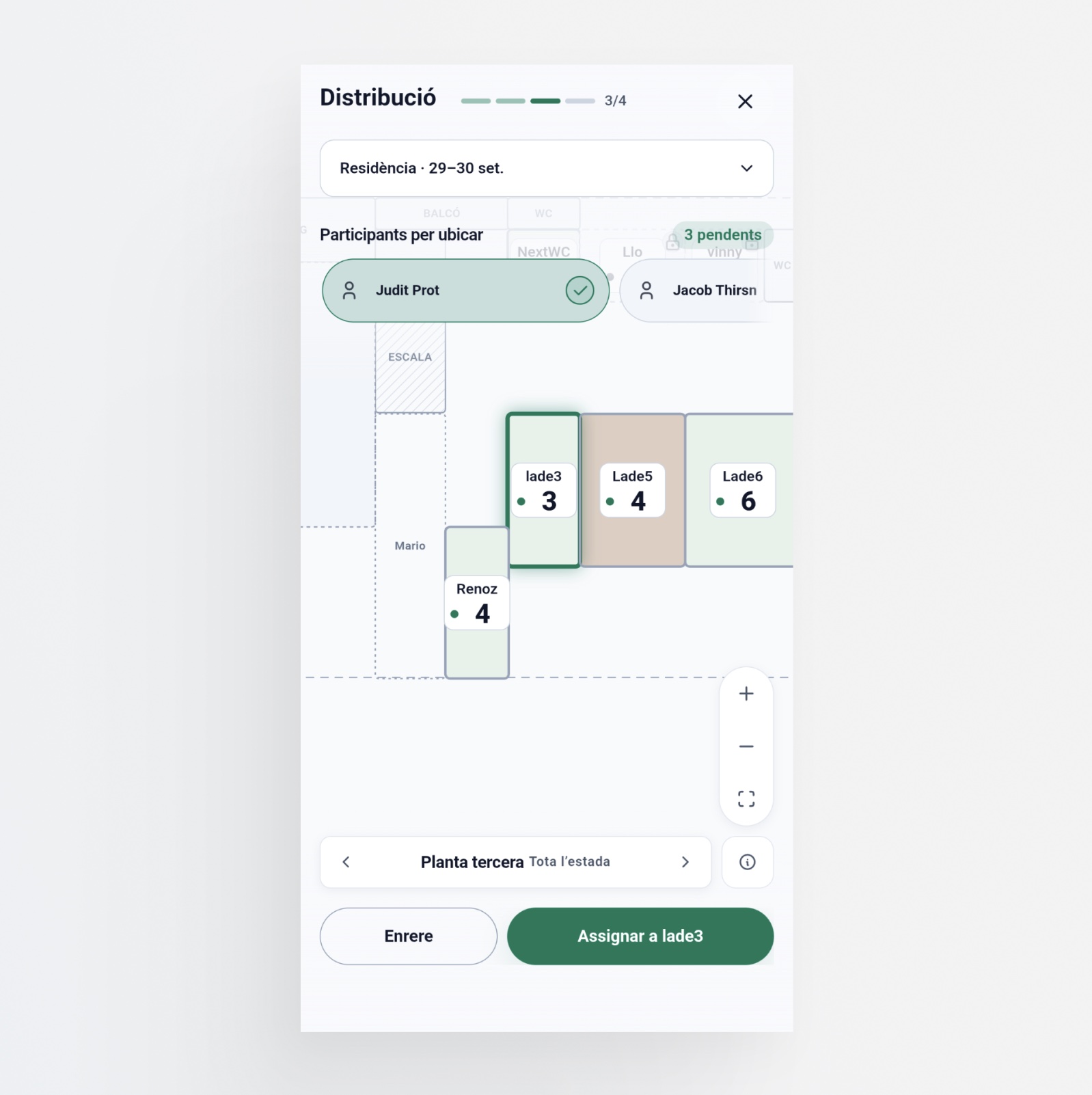
| The initial idea | Assign people to rooms using dropdowns organized by floor. | |
| The clash | Abstract and slow. With no spatial reference, every assignment was a blind click. | |
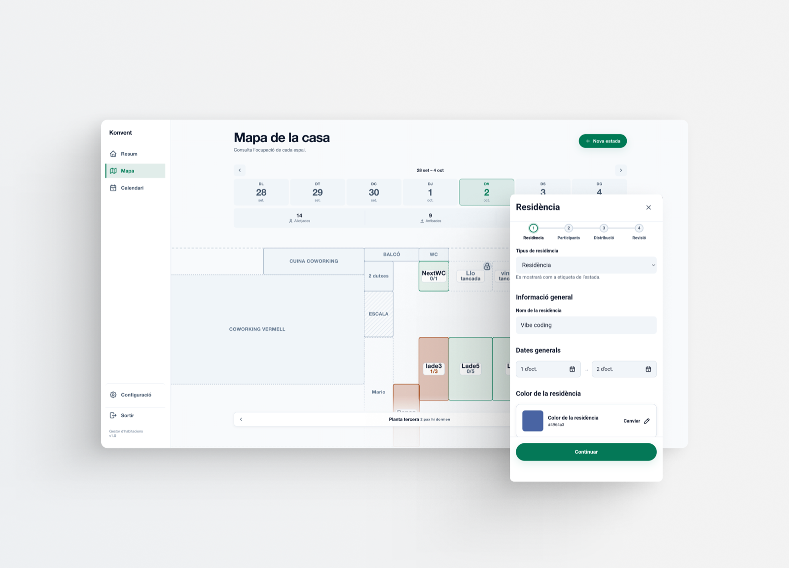
| The redesign | A map. An isometric view was tried first, and it added nothing. The top-down view is understood in the first second: it is the one users already relied on to solve the problem, so it builds on a familiar solution, not a novelty. | |
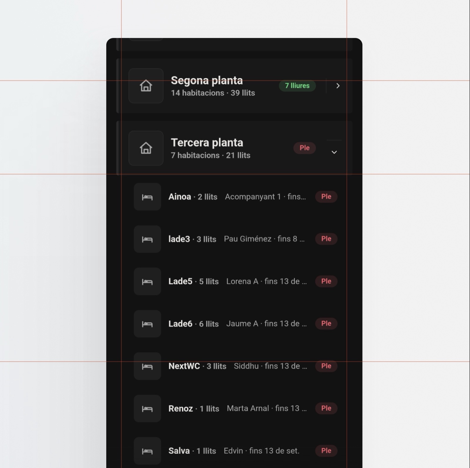
3 · A backoffice far from the urgency of day-to-day work
| The initial idea | Manage the rooms from a separate backoffice. | |
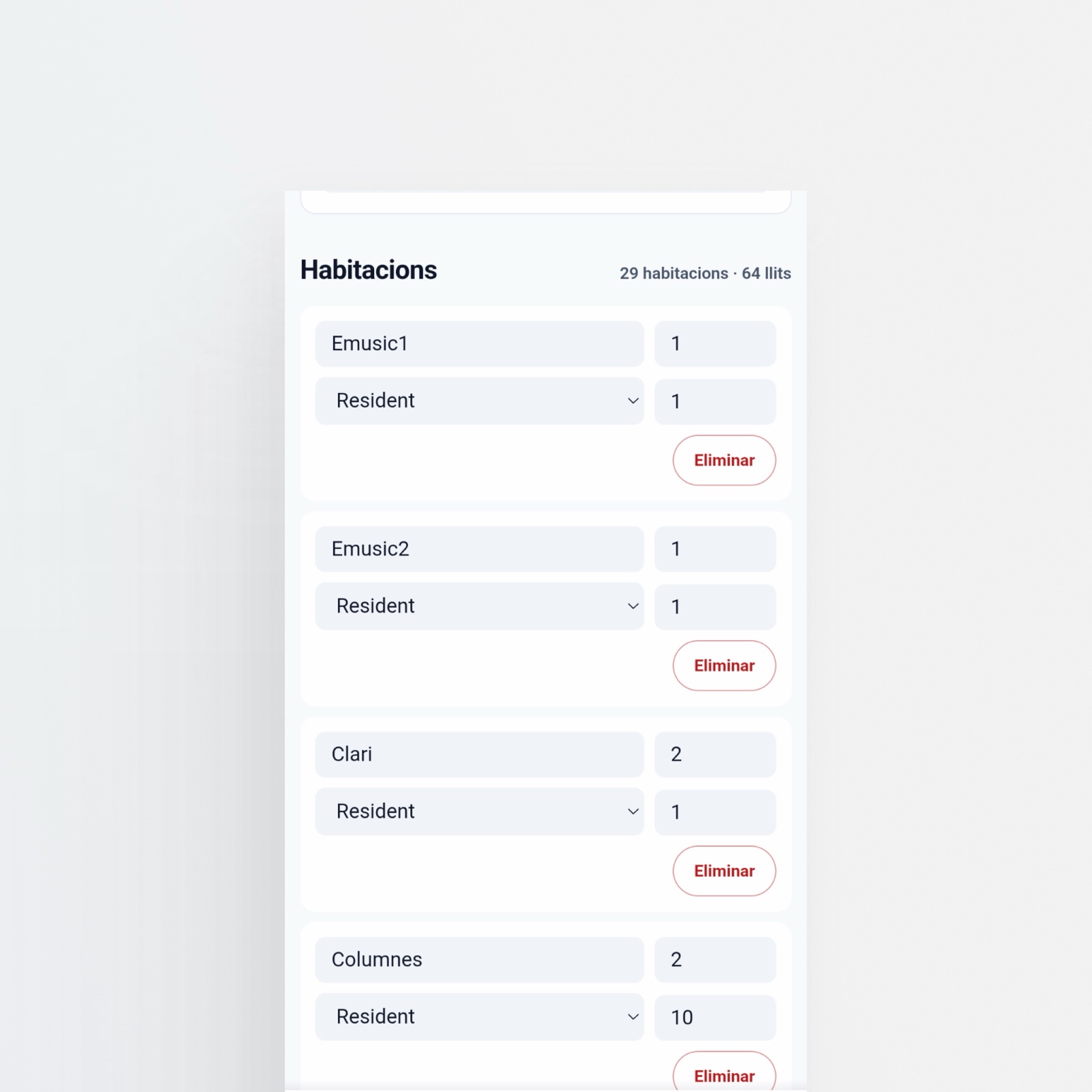
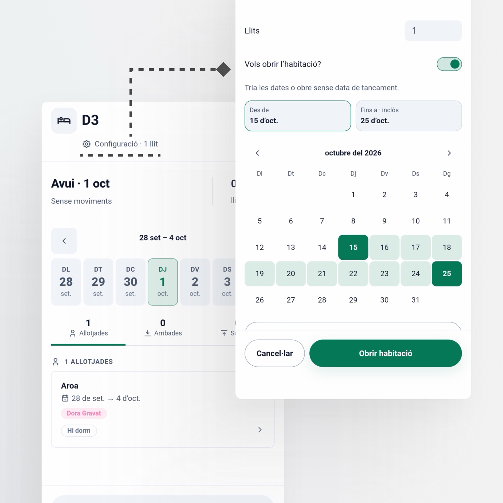
| The clash | The product has to move quickly. Opening or closing a room, adding a mattress: these things happen throughout the day, and going through the backoffice every time was friction. | |
| The redesign | The room card gains that power: capacity is edited there, and a room is opened or closed from the map. The backoffice stays for structural tasks, such as adding new rooms. | |
One root, different needs
Stay types
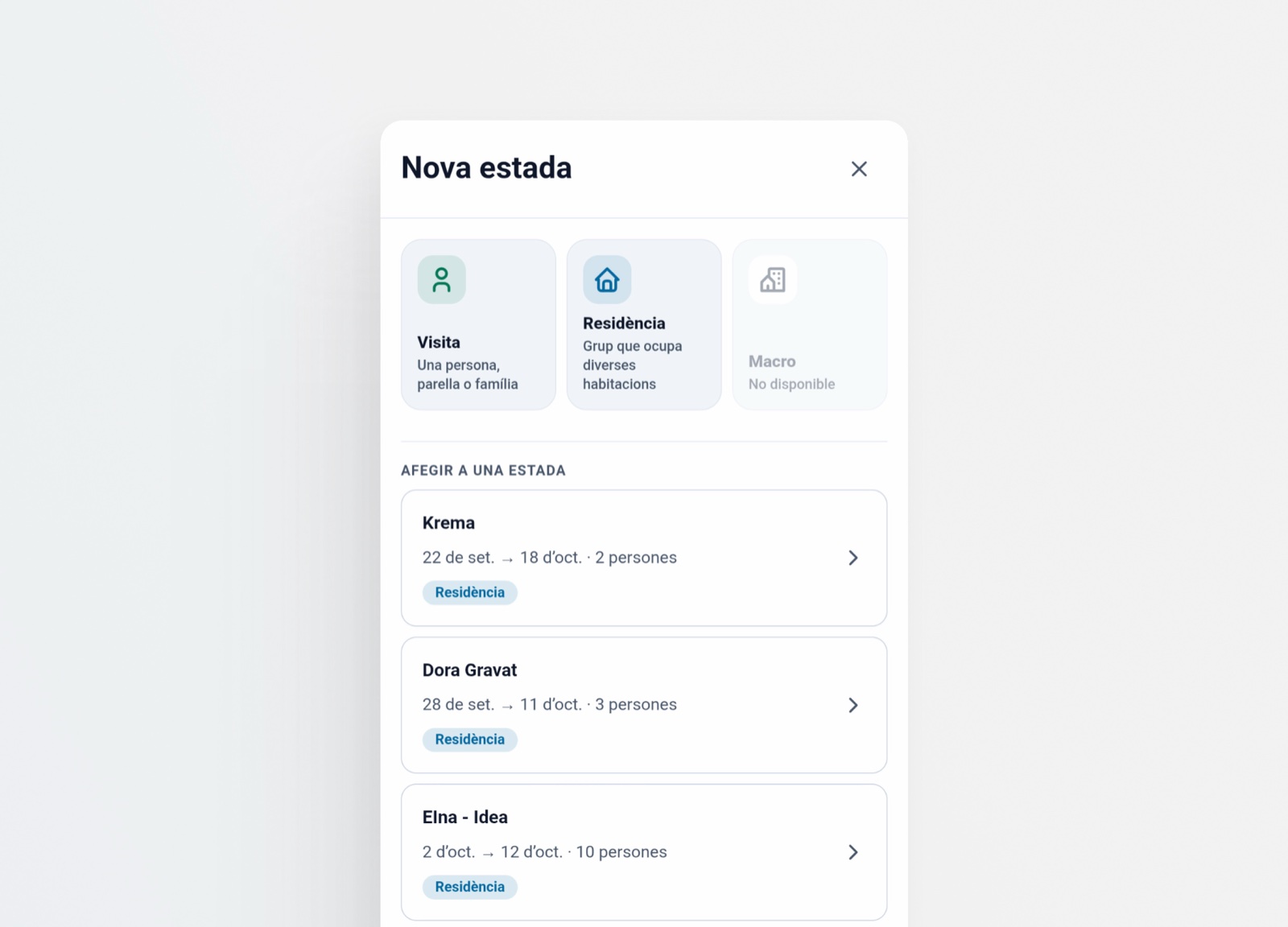
Not all stays are the same. The system distinguishes three types, and each is managed differently.
| Type | What it is | How it is managed | Scale |
|---|---|---|---|
| Visit | One or several people who come for a specific occasion | Rooms are assigned according to need and availability | One or several rooms |
| Residency | Group with fixed dates | Each participant has their own needs and circumstances | Several rooms |
| Macro | Event that takes over the whole house | Maximum occupancy: rooms plus common spaces set up for sleeping | More than 60 people |
The simplicity of a complex flow
Registering a stay starts with an innocent question: “Who is coming?” From there, the tree branches out:
- One person alone. Straightforward.
- Several people. How many, and what ages?
- Adults. They always take a bed.
- Children. Do they need a bed or not?
- Babies. Do they need a bed, or do they sleep with their parents?
- Dates. Which days? Continuous or not?
- Rooms. Which are available and which are taken? How many beds does each have? Will they share a room? A bed?
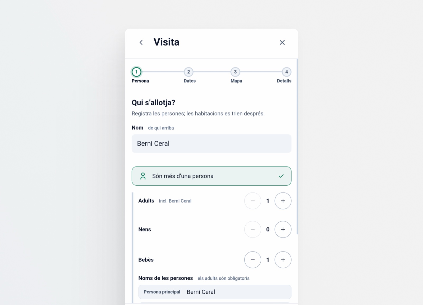
Any combination fits in the same flow, and so do changes: editing has to be quick, without losing context or starting over.
| Case | What is recorded |
|---|---|
| A family with three children | 2 adults and 3 children, each child with or without a bed. |
| A couple with a baby | 2 adults and a baby who sleeps with them, without a bed of their own. |
| A group of ten adults | 10 people, each with their own dates. |
| A person with non-continuous dates | Two date ranges for the same person. |
| Someone arrives later | The check-in date is adjusted. |
| Someone leaves earlier | The check-out date is adjusted. |
| Someone did not need a bed | The bed is freed without redoing the stay. |
When the flow does not scale
The form works for one family. For a residency of 20 or 30 people, the participant list already exists in an email, an Excel or a message.
The second path: the smart list. You paste the names and each line becomes a record with its name and dates. No form needed.
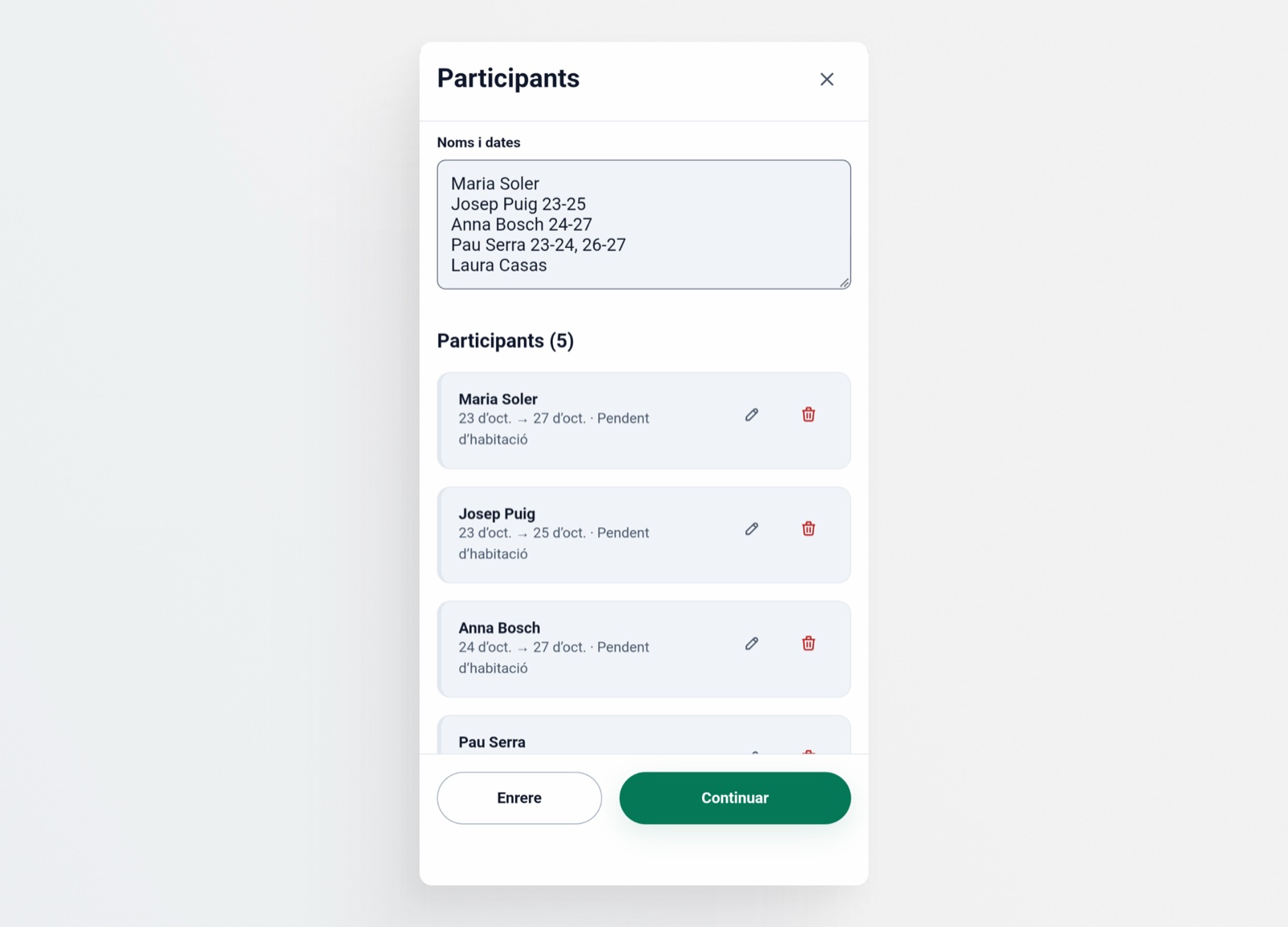
| Form | Smart list | |
|---|---|---|
| Visit One person or a family |
Quick and manageable: few fields and control over the detail. | Unnecessary: not worth it for so few people. |
| Residency 20 or 30 people |
Unmanageable: repeating the same fields dozens of times is tedious and kills the speed. | Quick: paste the list and each line is a record. |
A product with no learning curve
Not everyone knows how to use an Excel. In contrast, the patterns of any app —lists, buttons, selectors, icons— form a visual vocabulary that almost everyone recognizes.
K Rooms is built with that vocabulary, and it works the same on mobile as on desktop. Managing stops being “something you have to know how to do”.
What was not built
What was decided not to do explains the product as much as what was done.
| Ruled out | Why | What was done instead |
|---|---|---|
| Native iOS/Android app | For 3 or 4 people, maintaining two apps is not worth it. The browser is already on all their devices. | Responsive web app. |
| Own backend on the Pi | Several people edit at once and need to see changes in real time. | Firebase as the data layer. The Pi only serves the application. |
| Email and password sign-up | The people who manage already know each other. A full account system would be friction with no value. | Invite-only access. |
| Public viewing mode | Opening it before having a stable MVP would only generate noise and confusion. | Access only for those who manage. Phase 2. |
| Push notifications | They did not solve the real problem, which was fragmented information, not a lack of alerts. | The single source itself. |
| Google Calendar integration | Copying information to another place brings back the original problem. | The map as the only operational view. |
| Billing or fees | There are no financial transactions between Konvent and its residents. | Nothing. |
| Multiple languages | The context is local. Several languages dilute the shared vocabulary. | A single language. |
| Analytics dashboard | There is not yet enough usage volume to justify it. | Nothing. Phase 2, if needed. |
The pattern
Each “no” protects a deeper decision: K Rooms is an operational tool for a cultural center, tailored, with minimal external dependencies and designed for volunteers.
It is not a SaaS. It is not a mobile app. It is not a commercial booking system. It is not an analytics dashboard.
The result
Before, the information lived scattered across a set of analog tools —spreadsheet, printed plan and door labels— and every change depended on someone cleaning it up.
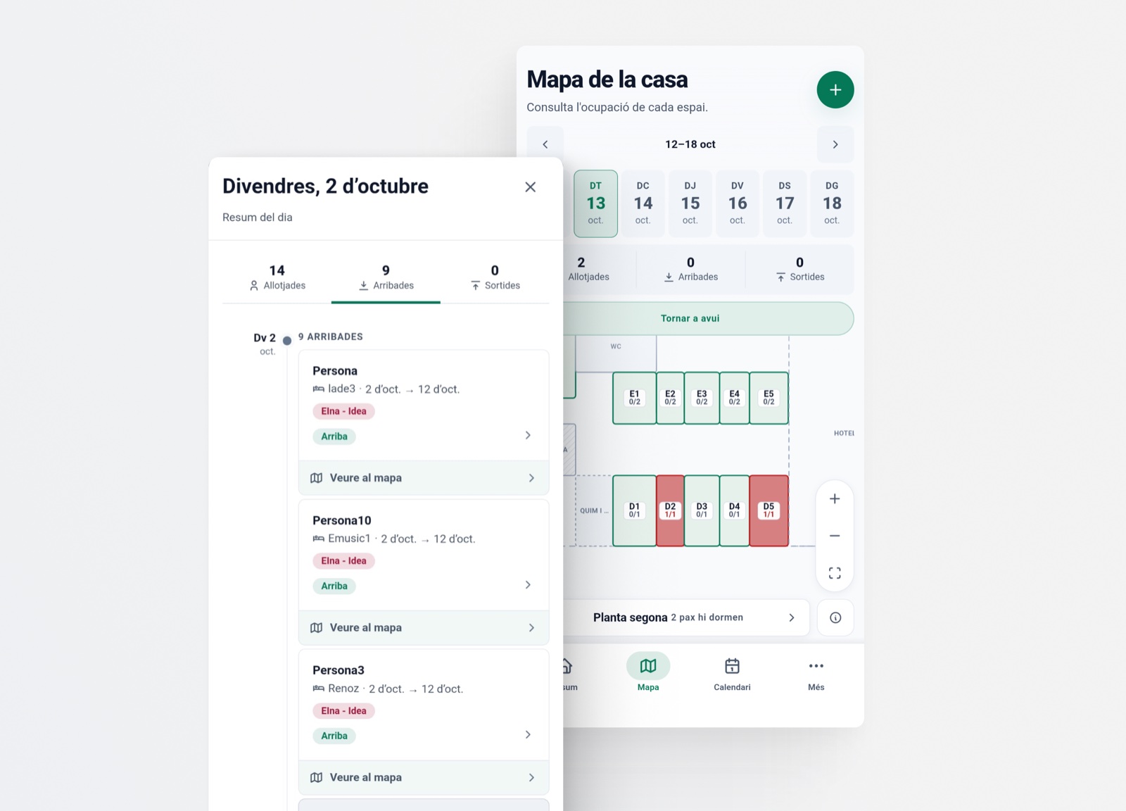
Today it lives in one single place. Whoever manages enters or edits once, and the data and the rooms update instantly for everyone who manages.
A single source of truth, shared and always up to date. The 3 or 4 people who coordinate the work operate on the same thing and see the same thing, without contradictory versions or changes lost along the way.
What cost the most is reduced: error and confusion, improvisation, stress and the time spent reconciling files. And speed is gained: the information is available when it is needed and changing it takes seconds.
What was learned
- The single source, first. Before adding features, it pays to close off the possibility of two versions of the same information.
- Understanding the goal when a flow does not scale. A form that works for one person is a burden for thirty: instead of polishing it, another path built for volume is opened.
- Looking at how users solve the problem themselves. A plan of the house already existed in the Excel: the top-down map picks up that way of thinking instead of inventing another one.
- Data that helps decide. Show what is needed today, not everything that can be measured.
- A product people already know how to use. Proven patterns, minimal friction and nothing new to learn.